Alphabet in Stone, Dom Hans van der Laan

Tags graphic
Disciplines graphic
Alphabet in Stone, Dom Hans van der Laan
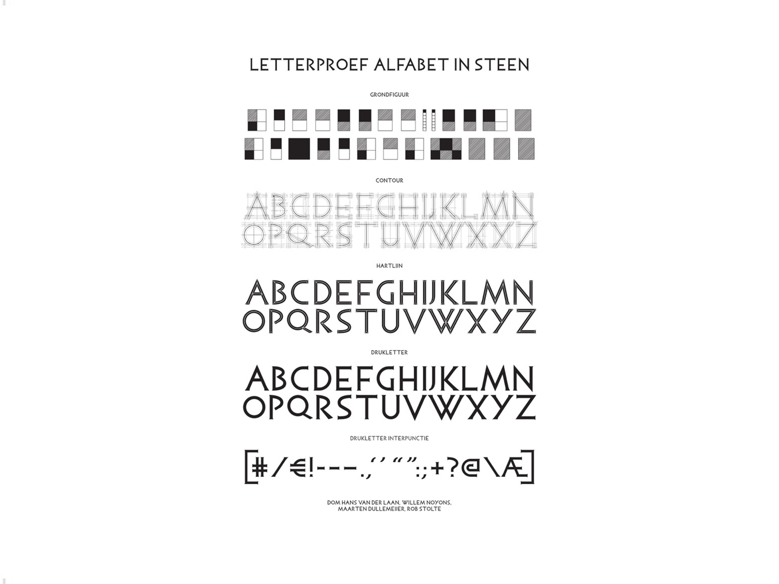
In his notes Dom Hans van der Laan has described the figures of the letters: "The fundamental shapes of the letters are the square and the rectangle 3: 4. They form alone or in combination, a series of 5 authentic figures. Doubled they form a series of 5 derived figures."
These authentic and derived figures are digitized for the first weight of the digital Alphabet in Stone. Because a digital font may not contain shades of gray, a diagonal hatching is used for rectangles - in accordance with the sketches of Van der Laan. The line width of the figures is substantially, this is however essential for use on a small scale. The first weight is as it were "the foundation" for the other three weights.
Not only the characters have been described by Van der Laan, also the spaces between the characters are defined. These intermediate spaces are also built up from the fundamental figures. Which fundamental figures these are, will depend on the shape of the sides of the adjacent letters: "The sides of the characters may be straight, curved, or inclined."
Determining the space between letters is called kerning. In the case of the Alphabet in Stone there are almost 3000 values which need to be described. Autobahn has now been completed the kerning and applied it to the first weight. The other three weights will be assigned the same kerning.
Despite the detailed notes of Van der Laan, there are some gaps that will have to be filled in by Autobahn. For example, the letters I and J will be assigned neither an authentic nor a derived figure. Autobahn has drawn a figure at their discretion. Concerning the spacing between characters, it is not always clear whether a side of a letter is straight, curved or inclined. The right-hand side of the letter C or the left-hand side of the letter J are examples of such cases of doubt. The final representation of the words will be decisive.
Van der Laan acknowledges the incompleteness of his notes when he appeals to the sense of form of the designer: “Some sizes for the letters: some are not very sure. You should take these measurements as a principle and then draw them by hand.” Although Van der Laan is addressing the script sculptor, this is also true for the digitizing process. Letters like B, P and S will take more time because of their curved shapes.
The digital Alphabet in Stone is made in cooperation with:
Atelier Willem Noyons